-
 Sun 1st Aug 2010 00:52 #41 / 88
I like having just the logo on the front. On the back... how about "A new way to play" ?
Edited Sun 1st Aug 01:05 [history]
-
Sun 1st Aug 2010 06:53 #42 / 88
BAO alternative:
I would wear the logo on the the back, sans the War and the ear (Just the G). And on the front wargear.net upper right, nice and small like a designer name, or just the logo.net on the front, nothing on the back, designer name style, but then I like some of the cutesy phrases too. I guess I prefer subtlety.
https://sites.google.com/site/m57sengine/home
-
Sun 1st Aug 2010 07:18 #43 / 88
Longest innings. Most deadly.
(WGlogo).tom
-
Wed 4th Aug 2010 03:13 #44 / 88
Eat. Drink. Risk.
Wargear.net
(Something tiny in brackets)ie.
(Food/Drink not included)
(Sleep is for sissies)
(World Domination is the first step)
(If you're not first, you're dead)
(What's BAO?)Edited Wed 4th Aug 03:21 [history]
-
Wed 4th Aug 2010 18:54 #45 / 88
Some people work.
I plot the elimination of my enemies online.
WarGear.net
something like that?
-
Wed 4th Aug 2010 20:05 #46 / 88
Give a man fire and he's warm for a day... but set him on fire and he's warm for the rest of his life.
Viper wrote: Some people work.
I plot the elimination of my enemies online.
WarGear.net
something like that?replace "elimination" with "destruction" or "decimation" or "annihilation".
-
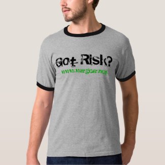
Thu 5th Aug 2010 13:57 #47 / 88
Got risk?
-
Thu 5th Aug 2010 15:58 #48 / 88
Longest innings. Most deadly.
Got balls?
-
Thu 5th Aug 2010 15:59 #49 / 88
BAO alternative:
Got armies?
https://sites.google.com/site/m57sengine/home
-
Sat 7th Aug 2010 18:29 #50 / 88
I like Andernut's so far.
I should add that from my perspective I want the shirt to be something that Risk board game players see and make them want to sign up. On the downside it may not be a great idea to see t-shirts using the Risk trademark (although I understand this trademark is just for RISK in capital + red).
-
Sun 8th Aug 2010 23:04 #51 / 88
It's for fun... if anyone comments that the quality isn't Bond worthy, we will just mention that it is because we are all too busy having fun with strategy games!
I think it would be cool, and a good way to advertise. Of course we can also advertise the site on facebook etc too. I do!
-
Mon 9th Aug 2010 10:44 #52 / 88
I think Andernuts "Got Risk" in bold white letters on the front of a dark shirt would be sweet.
-
Mon 9th Aug 2010 10:55 #53 / 88
I'm a man.
it's too cliche and overused as is. i wouldn't want to add to it. we can do better.
But I can change,
if I have to,
I guess...
-
Mon 9th Aug 2010 13:02 #54 / 88
Longest innings. Most deadly.
World domination.
No cleanup.
wargear.net.
-
Mon 9th Aug 2010 22:55 #55 / 88
I'm a man.
Cleanup in Aisle-strailia.
risk much?
But I can change,
if I have to,
I guess...
-
Mon 9th Aug 2010 23:37 #56 / 88
Never Start Vast Projects With Half Vast Ideas.
I think weathertop's "Risk Much?" is nice with something referring to wargear.net added in (maybe as subtext like a signature).
-
Tue 10th Aug 2010 00:05 #57 / 88
I'm a man.
theres a couple i like from this whole thing:
Play at your own 'Risk'
a new way to play
risk much
Gear upof these, i think the following makes the best combination for a shirt.
Front (pocket logo sized):
'G' (just the G from the logo)
Risk Much?Back:
www.wargear.net
Gear up!or
Back:
www.wargear.net
a new way to play
But I can change,
if I have to,
I guess...
-
Tue 10th Aug 2010 01:06 #58 / 88
Zazzle.com
Front and Back adds some $$$ and dark colors add some $$$, which was tough from quickly playing with it to keep it under the $20 mark, under $30 could be done and $30-$40 wasn't unnormal when I was playing with it, that seems stretching it IMO for a T-shirt. But it seems quick and easy to set up a store on Zazzle, and with the ability to add multiple multiple products it would really be up to what the players want to pay and not even really a big deal to have quite a few products.
-
Tue 10th Aug 2010 02:57 #59 / 88
Mongrel: "Yeah, If 11s is not eliminated in the first 5 rounds - back to the drawing board." SO TRUE!
W and G should be in caps on the shirt, and you can drop the www:
WarGear.net
-
Tue 10th Aug 2010 10:54 #60 / 88
I'm a man.
who has just the 'G' from the logo? tom you have that somewhere we can download it too?
But I can change,
if I have to,
I guess...


